Blog
Weapons Declassified: Dan Cassaro

Written & Designed by: Raji Purcell
Edited by: Jon Savage
Whenever I’m hungry to look at some great typography, hand-crafted or otherwise, I frequently find myself returning to www.youngjerks.com. Young Jerks is the moniker for the Brooklyn based (yet frequently traveling) designer Dan Cassaro. Though Dan is obviously fantastic at everything from motion design to illustration, it’s his typography work that captivates me most. Often somewhere between computer rendered and hand done, and methodically organized to flowing and organic; Dan knows how to throw-down some letters. That being said I was all the more excited to see his talk and briefly meet him at WMC Fest.
Heres What Happened:
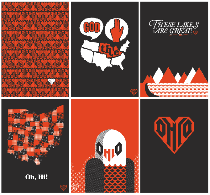
Dan took the stage briefly explaining Young Jerks as being a design shop run by just him, “just one jerk”, and telling of his excitement to be speaking at WMC in Cleveland, further explaining most of the people in Williamsburgh Brooklyn, where he lives, are from Ohio (a statement I can relate to being from Florida). This Midwestern saturation was the impetus for his God Bless The Midwest journal set, which was inspired by his friend’s mantra and love for Ohio.
“I put it on my website, but I had always felt sort of fraudulent about it because I had never been here. And I’d get written up on blogs about it and they’d be like Yeah Dan Cassaro! Midwest pride! It became really clear that I had never been there when I showed her this one and she said Dan you know there are no mountains in Ohio right?”
 Dan then began the rest of his talk by speaking about how he became a designer. Early on he went to school for “communication” not full knowing what that even meant. Then realized he belonged in an art school all along. “I loved graphic design immediately because it touched everything and was influenced by everything. It was so open ended; I could try anything. I could draw, or paint, or try animating. I eventually settled into typography and illustration. It was a really good chance for me to figure out what my place was in the commercial art world”. Dan had figured out what type of designer he was, and developed his own test for people to know what kind of designer they were as well. Taking his cues from a book that said you can find out people’s personality types from their favorite member of the Beatles, Dan decided that most designers are either John Lennons or Paul McCartneys. Here’s how he broke it down:
If you’re a John Lennon, you are creating work that is message driven, serious, it has an agenda, it’s emotional. But it might come across as pretentious or a little naïve.
If you’re a Paul McCartney, you’d be creating this meticulously crafted, beautiful graphic ‘pop’ design. It would be heavy on style but sometimes it’d be light on content.
Dan continued by saying that either of these approaches can be successful in their own right but when you have the opportunity to utilize both in harmony is when you can create your best work. However, Dan confessed he is more in the Paul McCartney camp, in design and just general loving of his music.
“I’m a huge McCartney fan, I love his music, I love his early Wings albums, all that stuff. I named a typeface after him called McCartney, in Paul and Linda weights.”
 Dan began to speak about Paul McCartney’s music in a way that stripped it down to its very creative essence. In that sense you could really relate his music to any creative medium, like graphic design. McCartney’s music is a vessel in which you can conform or expand your own experiences without too much personal detail getting in the way. When artists leave room for the audience to expand themselves into their work it became a much more personal experience. Dan related this to being in love and just needing a song to sing about it, not someone to tell you that you are. This in turn relates to your client work. You have the message its your job to get people excited about it through utilization of appealing style.
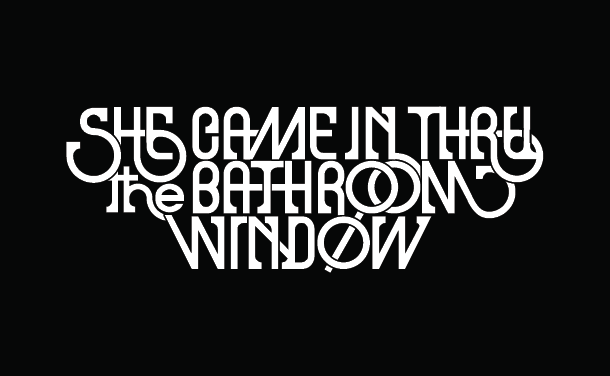
 Dan began to talk about his own work and his theories behind expressive typography. Expressive typography brings together two forms of expression. Written word which is used to explain what we can’t say with pictures and visual art which shows things we can’t say with words. In a basic way, expressive type bridges this gap. Expressive typography can also serve to refine phrases, writing, poetry and lyrics into a visual art form. In this way Dan feels that it can revive written words in a way that makes you have the same feeling you did the first time you listened to Stairway to Heaven.
Dan then showed slides of his intricate, illustrative, and beautiful dad-rock influenced typography work. Every slide proving his utter obsession with music and how it influences his work. His passion however is how he drives himself to make rewarding personal projects, like his project named Springstreets.
“I can be a really obsessive person but it works to my advantage as a designer sometimes. At least for my personal projects. About a year ago I was listening to a lot of Bruce Springsteen, and thinking about what a visual lyricist he is. How he writes his songs like he’s reading them off this imaginary map of New Jersey in his brain. So I thought I should make an imaginary map of New Jersey based off his lyrics. I was just going to do it for Thunder Road, but I wanted to plot the exact distance “of the long walk from your front porch to my seat”. It was sort of cute and fun and I was just doing it for myself, and then I did a couple more songs and then it got totally out of hand.”

Encompassing Bruce Springsteen’s first seven albums and exclusively using direct references from his songs, Dan created a 23×30 inch poster that became a huge success with Springsteen’s equally obsessive fans to which he sold out his first 500 immediately. “It proved to me that when we’re making personal work we should be making this work for ourselves, and trying to please ourselves. We shouldn’t be trying to please this imaginary audience out there because they don’t exist. If we’re making something and we’re really into it, people are not that different so they are going to respond to it.”

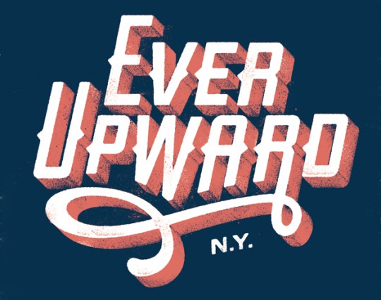
Another rewarding project of Dan’s is his ’50 and 50 project’. Initially, it began as a personal project to illustrate every state’s motto. Dan decided this was way too much work to handle alone. So, instead of doing all of it himself, he added another dimension to the project by inviting one designer from each state to illustrate their state’s motto.
“I think people got really excited about the opportunity to represent their home state. They turned out really great.” The collection of type treatments was completed with very little art directing from Dan other than size and color scheme.
Dan finished up his talk, discussing his plans to take his designing on the road. Dan was tired of sitting at a desk with the same view all the time. He realized aside from a few people much of the communication he has with the design community and people is through the internet. And since the internet is everywhere now, he wondered why shouldn’t he be everywhere. Hatching this plan in partnership with his girlfriend who is a scientist needing to travel as well for her research; Dan set out this summer in a mobile camper turned design studio. This notion said a great many things to me. Design doesn’t have to be a boring sheltered process, design doesn’t have to take place in a stationary building or city, design can be a traveling adventure. In a matter of twenty minutes Dan had me inspired to get out there. Seeing his talk provided the proof that Dan walks his talk, lives for adventure, and is born to run.
Listen to the Talk
As I watched every talk, I kept Garage Band open on my MacBook and recorded everything I could. The quality of the mp3 below may not be the best, but you can get an idea of what it was like from my perspective in the front row. Bootleg version!


