GoMediaZine:Hi Paul, thanks a lot for being part of this interview! I’ve admired your work for awhile now, so it’s pretty great to be talking with you. You don’t have much biographical information on your portfolio site, so can you start off by telling us a little about your background? When did you know you wanted to be a designer? Are you self-taught or formally trained?
Paul Lee: I guess my interest in graphic design started when I was pretty young. I wasn’t particularly gifted in drawing or painting as a kid, but I loved to look at typefaces and copy the nuances of the letter forms or sit down with a bunch of markers and try to come up with the nicest color combination. Later in high school, my dad bought me one of the early Powerbooks, and I started fiddling around with Pagemaker and a copy of Photoshop 2.5 that I shoplifted and started teaching myself to design.

I went to college at Berkeley, and fortunately they didn’t have a design program which forced me to get a much broader education than I would have gotten if I went to art school. I majored in Rhetoric, thinking I would go to law school after graduating. But it was a crazy time in the Bay Area with the dot-com era at it’s peak. There was a voracious appetite for designers at the time, even for an untrained amateur designer like myself. So I worked as a designer while going to school and fortunately, it got my foot in the door. I learned a lot and I began to think that I could actually make a living doing what, until then, had just been a hobby. After that I attended the MFA program at Yale for a year, but I dropped out because I was young and stupid. And I’ve been working since then thankful that I’m designing rather than writing depositions or preparing legal documents.
GoMediaZine:The white frame & distinctive logotype is a great way to identify your work around the web. I’d love to hear about the concept behind your personal mark/logo. What was your process in developing it? What significance does it have?
Paul Lee: I liked the idea of having my first name be the logo. There’s something offhand and chummy about first names that I thought felt good and would be an interesting counter balance to the work which I feel is sometimes a little cold and too polished.
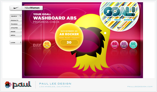
As for the white frame, it really just started with the impulse to brand the work with a watermark so that if a particular piece got passed around, at least people knew where it came from and where they could find more if they wanted to. At first, I wanted to do something more subtle, placing the watermark on top of the work, but eventually I just went with the white frame. If you go to the website and scroll down the page, you’ll see the logo over and over again. It’s definitely not subtle, but hopefully you’re more likely to remember the name. That was the idea, anyway.
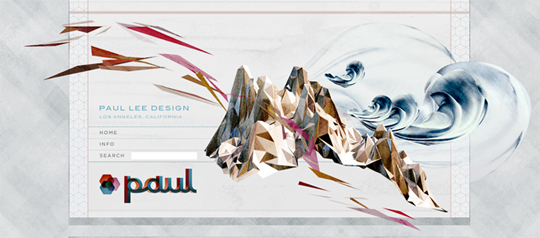
GoMediaZine:Can’t argue with that logic. Seems to work pretty well, I’d say. Your logotype was what drew me into your site the first time. Now, can you tell us a bit about the inspiration / influences for the angular shapes that appear in a lot of your work? Could you share a few of your favorite designers with us?
Paul Lee: Not sure where the fascination with these angular shapes comes from. And it’s definitely not just me. These shapes seem to be in the design zeitgeist at the moment. If I think hard, I think my fascination started years ago when I started noodling around in some primitive 3D program (can’t remember which one). The technology back then was so crude that whatever was rendered never looked all that great, but I always thought that the wireframes had an austere beauty to them. They were technical and raw, like the way a machine might see the world. Years later, I guess those wireframes have found a way into my aesthetic.

As for favorite designers, I’ve always admired and been humbled by the work of Mark Farrow. With a few gestures, he’s able to evoke so much with his work. The economy of his design always impresses me. Not surprisingly, then, I’m also a big fan of Peter Saville. Mostly, I’m inspired by his inventiveness, trying something graphically new and interesting with everything he touches.
GoMediaZine:Ah, I agree that wireframes can be beautiful. Sketches too – sometimes more interesting than the final colored piece.
Speaking of sketches, let’s talk a little bit about your workflow. Do you prefer working in Photoshop or Illustrator? What are some pieces of the process (without giving away too many secrets, of course) that create your incredible style?
Paul Lee: My pencil sketches are actually pretty awful. I sometimes wonder if I got into design because I was so bad with my hands. When I got my first Mac, I was so relieved to learn I could release a lot of my creative energy without having to pick up a pen or paintbrush. So yeah, although sketching out a few ideas are part of my creative process, they’re just to remind me of ideas I have, but definitely not anything pretty or interesting and I would be embarrassed if someone flipped through my notebooks.
In terms of process, I’m afraid there isn’t anything too enlightening to reveal. I get a few ideas quickly down on paper and then dive right into Photoshop. I find that starting out with only a vague idea of what I want the finished product to be is best because it then allows you to roll with all the happy accidents and revelations that come from actually working in the application. I think it allows the work to be more spontaneous and surprising. When I start out with a very rigid finished product in mind, I find it sucks the creativity right out of the process, making designing very tedious and the finished product less interesting.

The main application I work in is Photoshop. For fine-tuning pixels and colors, no other application comes close. The secondary application I used to use most often was Illustrator, but more and more, I find that that secondary application is now Maya. It’s a vast program that I’ve only begun to scratch the surface of. Working in 3D has really opened up a whole new world of visual possibilities. My feeling is that in the next few years, knowledge of a 3D application will be par for the course for any designer. If it isn’t, I really think it should be. Animators and Illustrators have worked in 3D to amazing effect, but I really think it’s time for designers to bring their sensibilities to 3D. It’s a whole new dimension out there to be explored. It’s changed my design dramatically and visually, and it’s opened up a whole new space to play in.

GoMediaZine: A lot of your work features beautiful photography. What are your thoughts about using stock photos and artwork? Do you usually process stock until it’s unrecognizable – or at least greatly enhanced? The photos in your work seem to share a beauty that’s beyond the typical shot.
Paul Lee: Oh boy, there are definitely many times I’ve spent all day looking for that perfect photograph among a sea of stock photography mediocrity. Photography is often the anchor for an entire composition, setting the mood and tone, so it’s imperative that you get the right shot. Once I do find the right shot, I do a couple color adjustments and not much else. I find it much more effective to find the right shot from the get go, rather than to manipulate the photo into something it didn’t start out as.
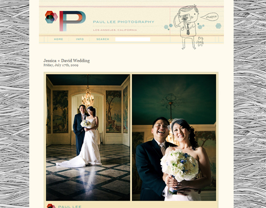
After feeling a little burnt out by design, I picked up photography a few years ago and since then it’s become a great passion and hobby of mine. You can see some of my photos here: http://www.paulleephoto.com (My dirty little secret is that I do wedding photography on the side to finance my photo gear which gets really expensive!) Learning how to use a camera and understanding lighting, color and composition has really developed my eye for the way I use photography in my design, cheesy wedding photography notwithstanding.

GoMediaZine: How do you get that nice grain / texture that’s very subtle in your colors?
Paul Lee: It’s mostly different combinations of Photoshop adjustment layers and texture overlays. I usually start with a “Curves” adjustment layer to get a strong contrast. Then a series of adjustment layers on top of that to control for saturation and color balance. The graininess comes near the end when I place a 50% gray fill on top of everything and set that layer as “Overlay”. Then I apply the noise filter to that layer and adjust the graininess to an appropriate level. That’s the simplified version of it, anyway. It’s mostly trial and error and tinkering with different settings until I get the desired effect.
GoMediaZine: How do you get most of your design work? Do you go direct to the client or through an agency or rep company?
Paul Lee: I freelance for agencies that have relationships, or are in the process of building relationships, with clients.
GoMediaZine: What type of work do you aspire to do in the future? What’s your ideal project?
Paul Lee: I see design work as a spectrum. On one end is design that’s strictly confined (by a client’s demands, by technical constraints, by strict brand guidelines, etc.). On the other end of the spectrum is design that’s completely unfettered by any constraints or parameters. The confined side of the spectrum sounds limiting, but there’s actually quite a bit of satisfaction that comes from working within tight constraints, finding the right balance and solving complex problems. The freer side of the spectrum sounds like a lot of fun at first, but designing with no constraints is actually quite paralyzing and can be aimless and meaningless.
To answer your question, on that spectrum, the ideal project is somewhere in the middle, perhaps leaning slightly more towards the freer side of the spectrum.

GoMediaZine: Seems like you have a strong sense for web UI design. Do you also do the development? If not, who do you work with?
Paul Lee: I’ve tinkered in HTML and Flash so I have a general understanding of development, but my code is pretty awful, held together by masking tape and twine. So, no, I don’t do any development. It’s usually handled by the site dev team at the agencies I work for.
GoMediaZine: What are your 3 favorite websites?
Paul Lee:
ffffound.com
gizmodo.com
npr.org
GoMediaZine: Hey Paul, it’s been really fun picking your brain and hearing your thoughts on life & design. For myself and our readers that are familiar with your work, it’s been quite a treat. For those who met you for the first time in this interview, I’m sure it’s been inspiring. Would you like to leave us with some words of wisdom?
Paul Lee: You know, people often ask me where I get my inspiration from. And this question always takes me aback because I don’t think I ever designed something as the result of some deep artistic inspiration or revelation. Most of the time, I’m just noodling around in Photoshop, seeing what looks interesting and running with it. I guess my closing thought, something that I’ve learned and embraced over the years, is not to take design too seriously. In the grand scheme of things what we do as designers is pretty insignificant. This may sound like a downer, but remembering our place in the world has actually done two very important things for me.
First, I think it’s made me an easier, more humble designer to work with. Since I keep a healthy distance from the work that I do, I can hear criticism and comments about my work more objectively, and the work can change and morph without me feeling like things are getting butchered and mutilated.
Second, and more importantly, not taking design too seriously gives me the freedom to explore and try new things without the weight of feeling like I have to create something of significance or merit. It’s only design, so let’s try these shapes, or these color combinations or this crazy composition. When I don’t take myself so seriously, it allows me to wander down the alleys of serendipity and whimsy. And it ultimately makes the work more interesting and novel. So in the end, the work that I create isn’t the result of some magical inspiration, but a series of accidents and discoveries that I’ve managed to corral into a finished design.
Those are my two cents, anyway. Thanks for the opportunity to share some of my thoughts out loud. And thanks for the interest in my design. You guys, keep up the good work.
