Très Chic Salon Branding

Go Media was approached by stylist Katie Skillman who was on a mission to turn her passion for hair education & styling into her dream business - a local Cleveland salon known as Très Chic. During the early stages of the brand development, we explored influences from French cinema, fashion, and even some understated vintage looks. At the base of it all, we knew the goal was a strong, classic and elegant identity that held up to its name Très Chic, meaning very stylish.


Throughout the branding process, we explored several potential applications for the identity. Everything from a business card and service menus, to the signage on the exterior of the building. Because of this, the Très Chic identity consists of a handful of logo variations to account for those various needs. You can find their signature TC scissor mark sprinkled across their marketing materials or featured on aprons worn by the stylists.


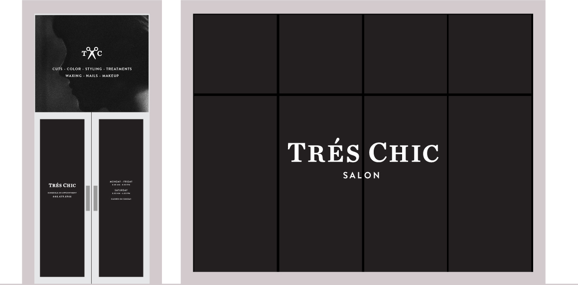
The development of the building in which the salon is housed was underway as we were working on the identity. This allowed us to explore all the possibilities for signage on the blank slate of an exterior that was coming soon. Here you see the initial plans for the window graphics as well as the finished corner sign featuring a stacked version of the brands' logotype.

Alternate Concept

