Blog
Become a Master Designer: Rule One: Limit your fonts
Part One of Seven Easy Principles to Becoming a Master Designer.
Rules about Using Fonts:
Ok, “master designer” might be a bit of a stretch – but you can at least become a “proficient designer” by following 7 easy principles. This will be the shortest, most informative series of blog posts you’ve ever read on how to become a better designer. Please note: these principles CAN be broken… these are not laws, they’re just general guides that all of us designers at Cleveland design firm, Go Media, typically follow when putting together a design.
Follow these simple design principles and you’ll be on your way to artistic excellence.
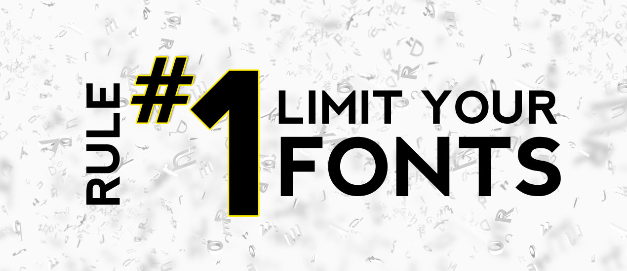
Principle One: Limit Your fonts. A big part of putting together a good design, as you’ll see, is making sure the over-all look is consistent. The best way to accomplish a consistent look to your design is limiting the number of artistic motifs (themes) that you use. The fonts you select are the first variable you want to limit. I typically like to pick just 2 fonts per design.
The first font can be fancy or artistic. This font will be used to give your design some flair, character and personality. It’s this font that sets the mood for the piece. Is it a fun font with swirls for a girl’s party, or is it a grungy evil font for a rock band? I would use this fancy font for the header copy – anywhere it’s big, I’ll use this font. The fancy font will be the focal point of the piece. You will usually have less copy in this fancy font, but it will be much bigger – so that’s what people will see and focus on.
The second font should be very basic. The audience shouldn’t take notice of this secondary font at all. This secondary font needs to be very easily legible. It’s this basic font that will be used for large bodies of copy. Obviously, it’s very hard to read large bodies of copy that are in some extravagantly artistic font. So, this second font is all about functionality.
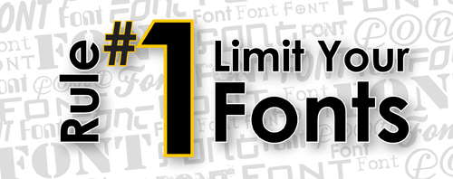
Here is an example of proper use of fonts in a design. As you can see, there is only two fonts used here. The fancy font is used as the headers and the basic font is used for the copy. It looks clean and consistent.

Here is a Bad use of fonts. In this case I used too many fancy fonts. It just makes the piece look inconsistent. The sub sections don’t seem like they match with the main header.

Having too many fonts in a design is the biggest mistake. Nothing looks worse than someone who has used 8 different fonts on their flyer. Even worse than that is using a very fancy font for your body copy. Here is a sample of font use at it’s worst:

One last thought before I let you go. If your fancy font looks modern or contemporary, then your basic font should be a san-serif font. If your fancy font looks old fashioned, then use a serif font for your secondary font.
That’s it for this quick post. Thanks for reading. Keep an eye out, 6 more posts coming in this series (one post per week.)!