Blog
Rule Six: Motion

Rule Six: Motion – Have movement through your design.
Part Six of Seven Easy Principles to Becoming a Master Designer.
Movement? Are we talking about a video here? How can I have “movement” in a static printed design? It’s not a flip book we’re talking about are we?
No, I’m simply talking about creating a sense of movement through a design. It assists in giving the end-user a clear path for their eye to follow. Sometimes this movement is instrumental in directing the viewer’s eye to the places you want them to look and even the sequence in which you want them to look.
This may be a little easier to understand if we look at some examples.
First, let’s start with a design that has no movement to it. Let’s assume that each of these circles are photographs or design elements. How will the end-user’s eye move through a design that is laid out like this?

They will probably “read” through the design elements in this manner. Why? Well, because in Western society – this is how we are taught to view things. It’s the way we read. Always start in the upper left corner and read left to right working your way down through the design.

This is the average westerner’s predisposition on how to look at a design. But we can break this method of viewing and impose our own. Let’s look at another very basic layout using extremely basic shapes. Except this time let’s give them an over-powering movement.
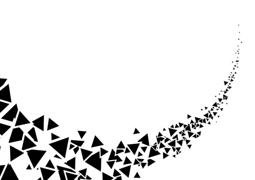

Ok, now this is a PAINFULLY obvious example of movement. If this were the design, the viewer would have almost NO options as to how to look at this design other than lower left to upper right.
I just want to make the obvious point that we CAN control, or at least heavily influence how viewers take in our designs. With this in mind – we need to make sure that the movement in our design helps the overall function.
Now, because I’m such a huge fan of comic books, let’s look at a few comic book illustrations that use movement in their composition to carry a person’s eye through the image.
This panel is by famed comic book artist Will Eisner. He was well known for amazing compositions – and his comic The Spirit (now a major motion picture.) This is a great little composition because you almost feel like you’re following the character’s movements. You start at the top of the illustration and snake your eyes down each set of stairs until you see the figure at the bottom.


The next example I want to use is the cover for The Fantastic Four #1 comic book. This is really a great use of movement in a composition. You either start at the title or at the monster in the center. In either case, the progression of movement after that is so wonderfully obvious. From the title you follow Human Torch’s flame over to the character list, then down to the monster emerging from beneath the street. From there, it’s a clear spiral working around the outside of the illustration; from the monster you go back through the Human Torch to Invisible girl, to the Thing to Mr. Fantastic and finally to the innocent bystanders.

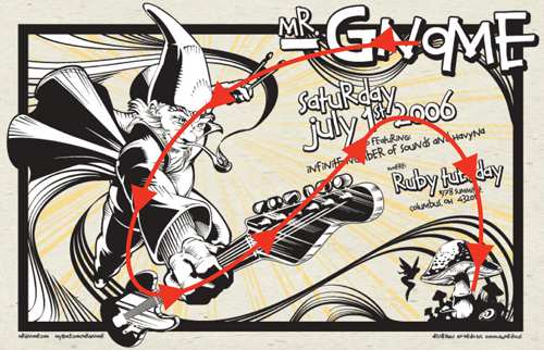
Let’s take a look at that with the path drawn on top.

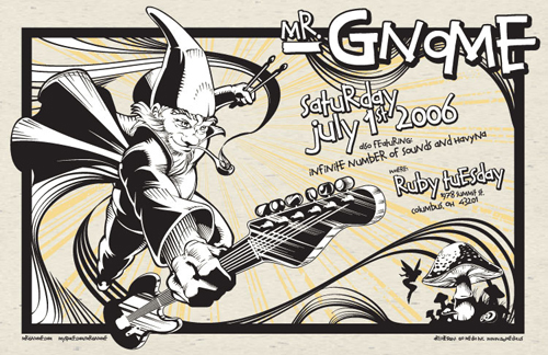
Let’s look at one last example – but maybe something with a better design application.
That’s it’s for now. As you’re waiting for Part 7, catch up on the rest of the series:
Become a Master Designer: Part 1: Limit your Fonts
Become a Master Designer: Part 2: Limit your Colors
Become a Master Designer: Part 3: Contrast, Contrast, Contrast
Become a Master Designer: Part 4: Spacing is your Friend
Become a Master Designer: Part 5: Depth