Blog

90’s Graphic Design Mood Board
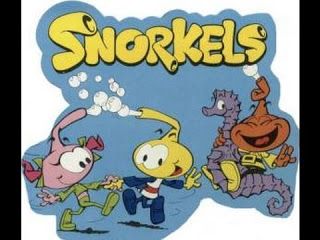
The 90’s were a magical time – a time of the Docs, Game Boys, and the sweet, sweet sound of AOL dialing-up. As everything that was once old is new again, the 90’s are making a come back.
Design trends from this era can be found in posters, album covers and fonts. As artist Dave Perillo has shown, even some of our favorite old friends are back in action. Deservedly so.

What about 90’s design is worth reintroducing, you ask? We created a mood board of sorts to answer this question and hope it helps uncover the truth. Below you’ll find 90’s posters, graphics, album covers, products, and other elements that may inspire you to create your next design piece enhanced with 90’s elements. We have arranged the elements in four categories. We hope you find this helpful. Enjoy!
90’s Design
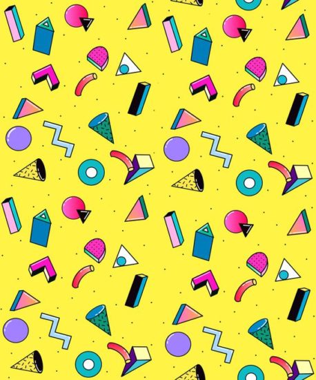
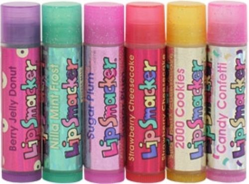
1 – Color like WHOA.
The 90’s was at once a wave of color and a dash of grunge. But for this moment, at least, we are rejoicing in glorious brilliance of it all. Think Pretty in Pink (literally), color pops, neon lasers and this 90’s cup design that kind of grows on you after awhile. Totally unapologetic!


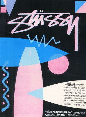


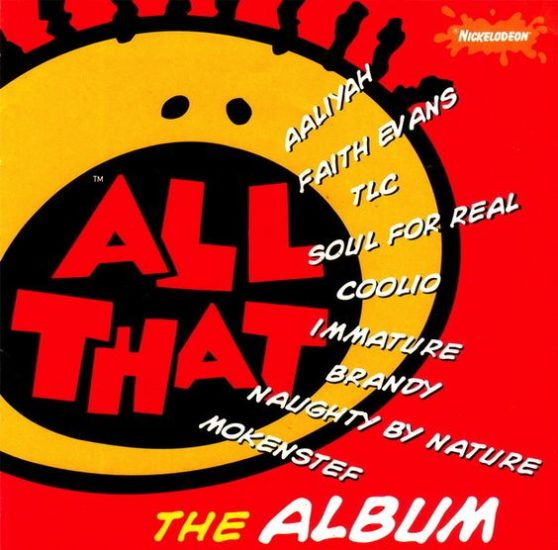
2 – Chunky Fonts.
If you take a broad look at fonts in the 90’s, you will see a lot of thick lines and truly unique fonts driven by theme. Oh – and we loved a drop shadow!


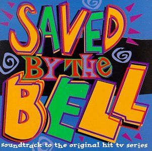


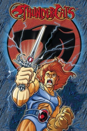


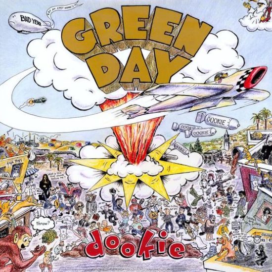

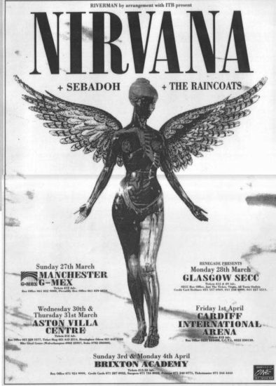
3 – Photo Posters
The focus around many of the posters or album art in the 90’s was around one simple graphic or photograph. Many of these are iconic posters and I think their simplicity speaks volumes.


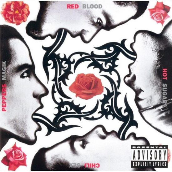
4 – From Bold & Vibrant to Black & White (and Red)
Though this era gave us a lot of pink, we also saw a lot of stark contrast – black & white – sometimes with pops of red.


What did you love most about design in the 90’s?
For more 90’s Graphic Design, head to the Go Media Pinterest Board.