Blog
How to Create Photorealistic T-Shirt Mockups

When designing for apparel, presentation of your proofs is very important. A detailed image of a piece simply will not suffice as an adequate proof. You want to hit the design home, and mocking it up on a t-shirt is what’s going to do the job. Apparel designs are much different than regular print jobs because you can potentially design around every nook and cranny of the garment, this is something you won’t be able to illustrate to your client with some large .jpeg. They hired you for your creative knack, and that’s what you’re going to need to bring to the table.
Now here at Go Media, we’re always mocking up something – many of them tees – and after a while we realized that providing a pack of tees geared towards designers for presentation purposes would be very cool. And we did just that… here at the Arsenal we’re hooking you with a bundle of 55 mockup templates that include all the essentials you need. Fronts and backs, clipping masks to isolate your artwork onto the appropriate areas, and even a shadow layer to placed conveniently on top to give it that authentic printed look! We took a lot of time and pride out on these to make sure they came out just right, because bringing the best to our clients is a goal we all share as designers.

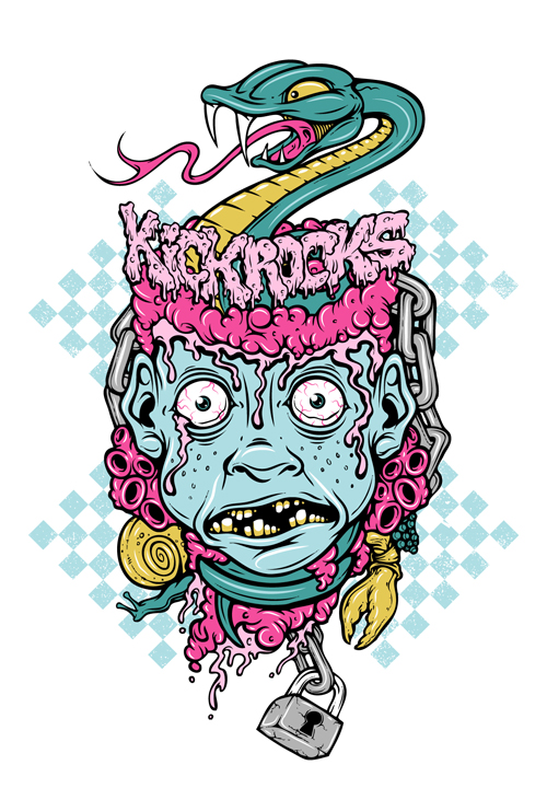
In this tutorial, I’ll be using a design that I created for Kick Rocks – an up and coming apparel company.
Author’s note: This process will also cover how I mocked up the “Designing on a Budget” tutorial’s end result (Vomit Whistle) onto a tee – which is the very thing that helped spark the idea to make the pack and this accompanying tutorial (thanks “nobahdi” who asked the initial question of how the shadows were applied to the tee, and everyone else who commented on the tutorial!).
Now we’re going to take our tee from the pack (Blue Front Wrinkled.tiff file) and open it up in Photoshop.

Now focus on your layer panel. This is the structure we came up with for these files.

Since the design that we’ll be using is intended for a white shirt, we’ll need to change the shirt layer that’s currently blue, to white. Before hand, I make the background layer a dull grey so we can distinguish the white shirt completely from the background. I then use the following settings using the Hue/Saturation tool to achieve the desired look.

Automatically you’ll notice that the shadow layers look way too dark. So we’re going to bump the opacity down to 50%.

Now we import our art. Open the file in Photoshop (and make sure it’s a hi-res export) and place it in the Your Art layer. Dragging it will work, copy and pasting, etcetera, etcetera.

Now we’re going to use the mask layer to make our printable area the only visible spot on the design. Grab the actual mask from the “Mask” layer (not the whole layer), and drag and drop it right onto the “Your Art” layer. You should now have no excess left around your shirt, and all wrinkles, the collar, and overlaps are preserved as if the shirt were truly printed. The best part is that you can still edit and move around your design. Make it bigger – move it off the edge – whatever – it will stay within the bounds of the shirt because of the mask. Check out the following image to get a better idea of what I mean here.

Now your mockup is done. If you feel you need more shadow now that the design has been placed in… then bump up the opacity of the shadow layer and you’re good to go.
Author’s note: I like to get snazzy so I’ll place some crazy texture on the background and fidget with it to make look all dark and complimenting to the garment. These additional presentation doo-dads often get the client very excited and way more interested in your work, versus a dull and boring round of proofs. And nobody wants to be stuck re-illustrating 3 to 5 times because of a half-assed proof’s inability to wow the client.

We’ve also got a quick video of how to set up the layers on vimeo.
I hope you enjoyed this tutorial and got to learn a little about the functionality of our new Apparel Template pack. Taking a progressive approach to the mock-up phase of apparel design is something that should be taken very seriously. As always, we provide (and use) the necessary tools to do so. Thanks for reading everybody, take care.