Blog
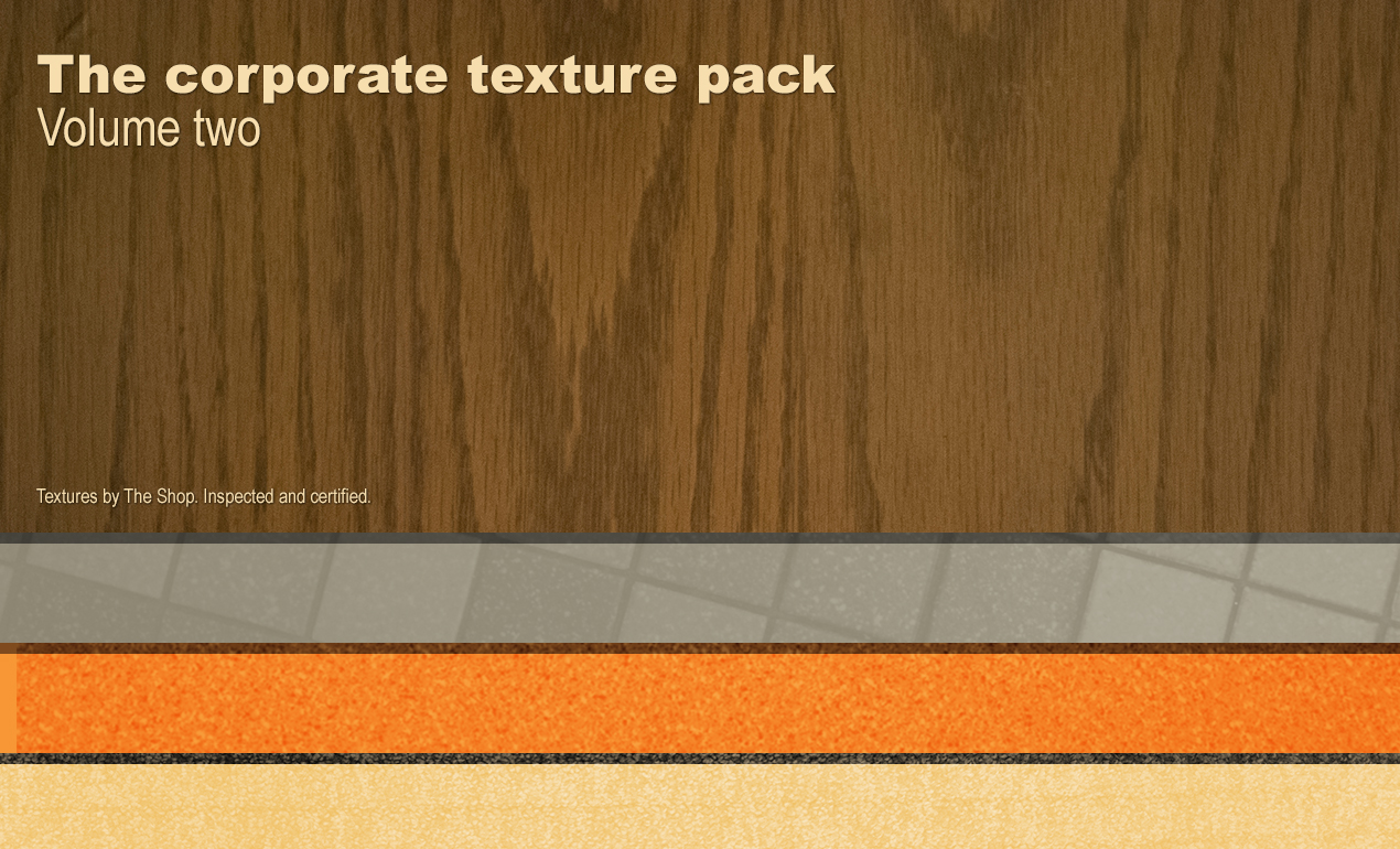
Poster Design Tutorial: How to Get Non-corporate Results with our Office Interior Textures: Corporate Texture Packs!
Poster Design Tutorial: How to Easily Get Non-corporate Results with our Office Interior Textures: Corporate Texture Packs!
Hello all! Simon from Studio Ace of Spade here today. I’m writing to announce the release of the corporate texture packs, volume I and volume II, on the Arsenal today! I’ve written a tutorial to accompany the packs. Enjoy!

How did these packs came to be?
Well, I happened to have access to one of the millions of generic office buildings around Cleveland this past winter. I couldn’t help but notice the wide range of often cheap imitations of materials in all of that office furniture and decor.
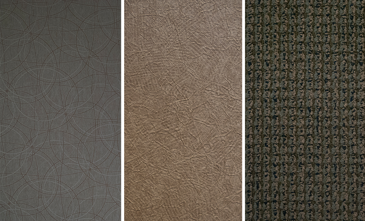
The textures range from fake wood grain, wallpapers, soulless tiles, blend fabric patterns for office furniture, etc. There are a few gems here and there, and if you’re looking to emulate the “9 to 5 stale job atmosphere that you could believe we’re in the Office or in Office Space,” these packs are your new best friends.
Hold on your horses, where’s the DIY spirit?
It seems a bit contradictory to create resources from an atmosphere we creative people usually deem at best stale. I’ve been the first one surprised by the good surprises hidden all over. For instance, while some of the wood grains are obnoxiously fake, some of them are actually bluffing. There are beautiful noise patterns in drop-ceiling tiles. I’ve rarely seen so many different fabric options while not in a fabric store. And I haven’t talked about carpets and wallpapers yet (although the pattern creators for some of these should probably not be allowed to design anything else of their lives).
Just have a look below:


A demonstration by the example
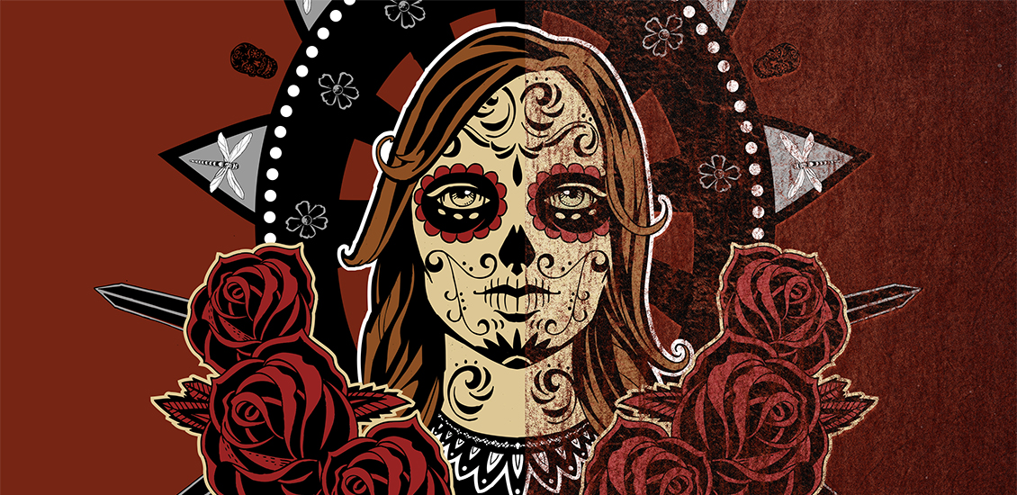
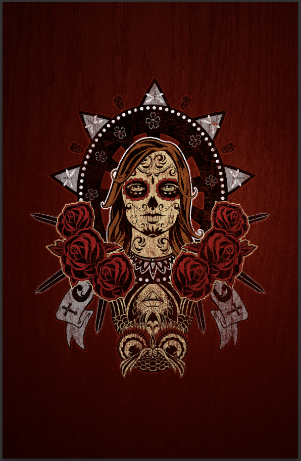
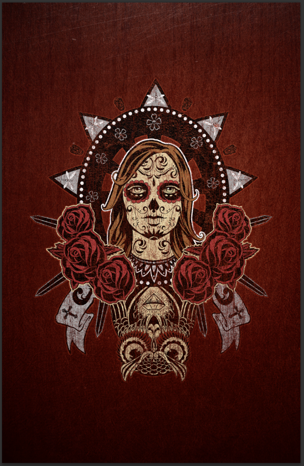
Rather than discuss things, I decided to show you how these two packs of textures can help us to spruce up Steve Knerem’s Day of the Dead vector t-shirt design pack. Don’t know what a t-shirt design pack is? Watch this:
What are we going to create?
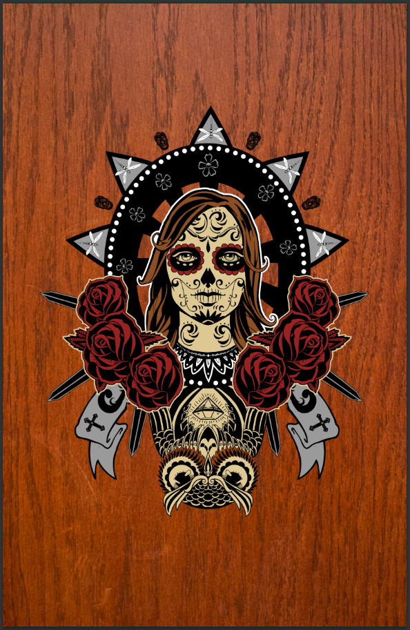
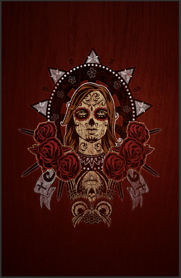
We’re going to take this great, flat colored vector piece, and turn it into a sweet poster with the help of the texture packs. We’ll use some wood grain textures to build a rich background, some of the noise and scratch textures to weather the art a bit, and some of the other ones to package the whole thing in a consistent ensemble. We’ll be using both Photoshop and Illustrator to accomplish this. Let’s go!

Preparing our document
First thing first, let’s create a brand new canvas in Photoshop. I’m using an 11″x17″ @ 300 dpi, RGB, document.

Once your canvas is there, create a few guides, so you have a basic grid in place. I’ve put guides to indicate the center of the frame (5.5″ and 8.5″), as well at 1″ of the edges (1″, 10″, and 1″, and 16″).

Bringing the art in
It’s time to bring the t-shirt design pack into our Photoshop document. Simply copy and paste the design as a smart object into your canvas. This will allow us to keep its scalability as we work on the piece.
Copying the piece in Illustrator

Pasting in Photoshop

I’ve scaled the piece so it’s approximately 9″ wide. Note that I haven’t copied the background along.
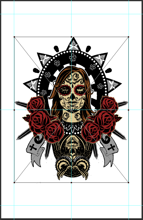
It’s simply easier to fill the background layer with the same gray (#454545) directly in Photoshop.

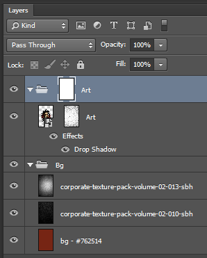
Oh, and don’t forget to do some layer house-keeping.

Adding textures to the background
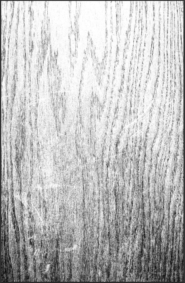
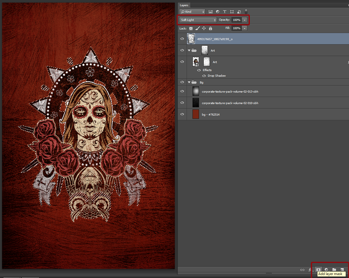
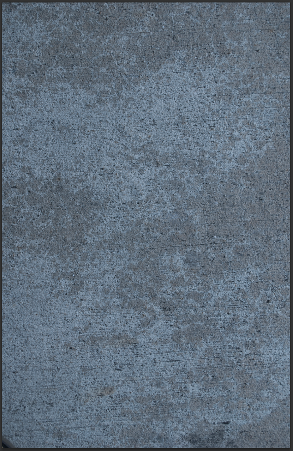
Our goal was to create a rich, warm, wooden background for the piece. After looking through the packs, corporate-texture-pack-volume-02-010-sbh.jpg looks like a solid starting point.

Let’s place it into our document, right above our gray background layer. Scale it up so it fills your whole canvas.
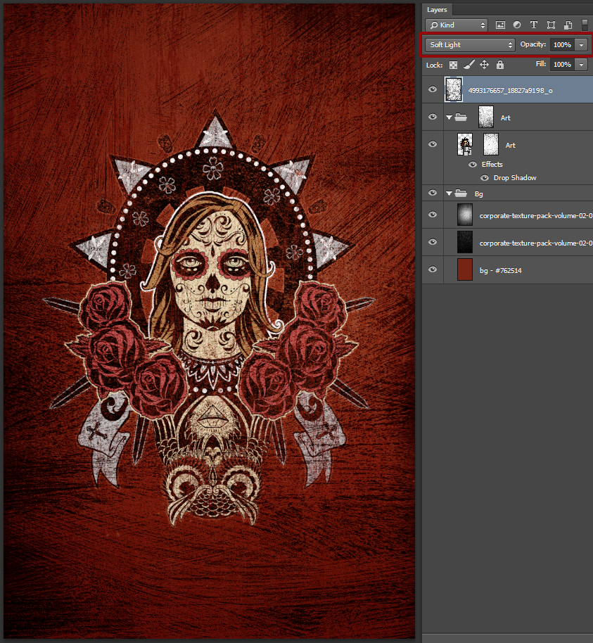
The result is interesting, but is a overbearing compared to the piece. First, let’s rasterize the texture layer, and sharpen it a few times (Filter > Sharpen > Sharpen). Once that’s taken care of, change its blending mode to Soft light @ 100% opacity.
The result is better, but still not very amazing.

To remedy the issue, start by desaturating the texture layer (CTRL/CMD+SHIFT+U).

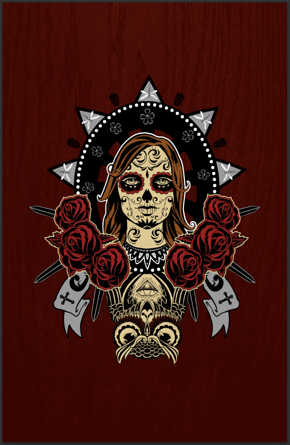
Next, change the color of the background layer to a saturated, deep brown. I’m using #762514.

(Don’t forget the layer housekeeping since you’ve changed the color)

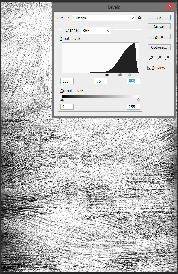
It’s better, but not there yet. Let’s use the levels (CTRL/CMD+L) to fine tune the contrast of the texture.

There you have it.
A quick touch to make sure that the art doesn’t fade too much in the background: let’s add a drop shadow to its layer. Well, more of a glow actually. The color of the shadow is the same brown than our background (#762514). Using the Linear dodge (add) blending mode for the drop shadow, we’re creating something along the lines of a very soft glow that visually detaches the centerpiece from the background, but without being obnoxious.

Here’s a closer view.

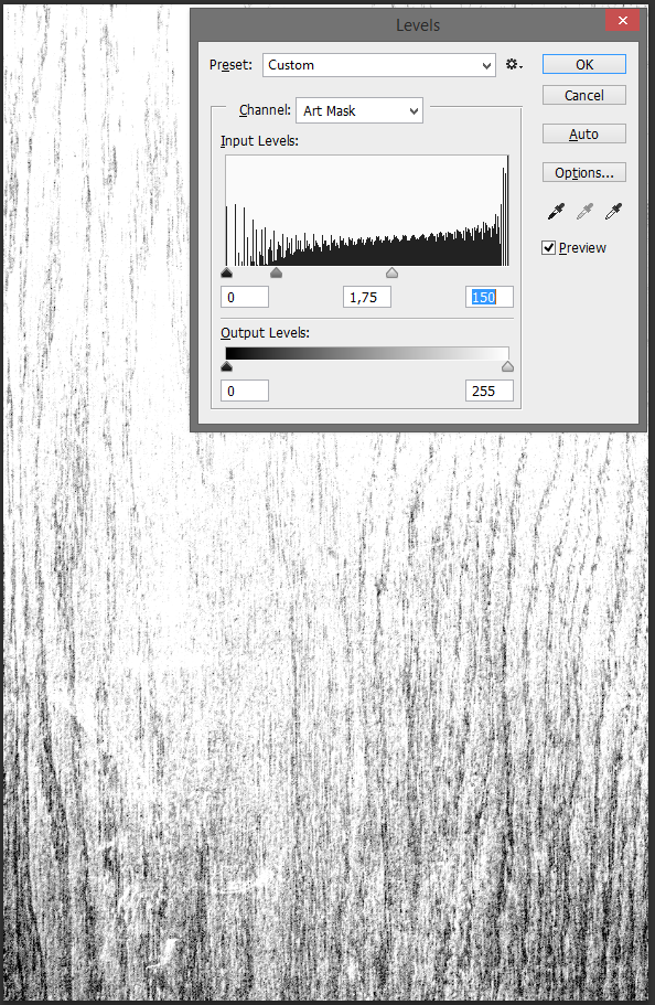
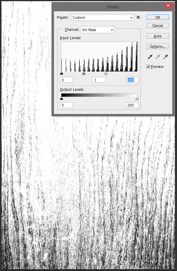
Let’s finalize our background with a slight vignette effect. After some investigation, corporate-texture-pack-volume-02-013-sbh.jpg seems like a solid candidate to accomplish the effect. Its center is brighter, and the edge of the texture is darker. We’re going to make sure these characteristics are more pronounced thanks to the levels panel.

Start by placing the texture in your document. Note that I didn’t transform it proportionally, but rather stretched it to fit the canvas.

We’re going to follow the same process than we did for the wood grain texture: rasterize, sharpen, desaturate, and enhance contrast with levels.

Desaturate and sharpen.

Levels. Note how much grain this step is bringing forward.

Conclude by changing the layer’s blending mode to Soft light at 75% opacity.
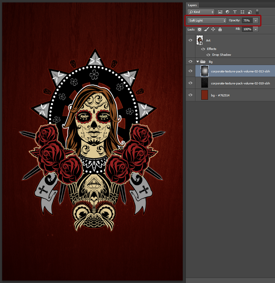
And we have ourselves a vignette.

With the background done, it’s time to move forward to the weathering of the centerpiece.
Centerpiece treatment
The main treatment we want to apply to the art is some kind of weathering. I’m planning on doing a regular grunge effect, and to re-apply the background’s wood grain to it, so it looks like chipping paint or something. First, some “regular” grunge. What we’ll do is paste textures in layer masks. Accomplishing such a thing is very easy:
- Open your texture.
- Copy its contents.
- ALT/OPTION+CLICK the thumbnail of the layer mask you wish to paste the texture into. This will show you the content of the layer mask, and allow you to edit it. Make sure to disable the little chain link of the layer mask so you can move the texture without moving the element along
- Make the edits you deem necessary (size, placement, sharpening, levels, etc.)
- Admire the result
After looking through the packs, I’ve spotted corporate-texture-pack-volume-02-034-sbh.jpg as a very good candidate.

Start by adding a layer mask to the art’s smart object. Make sure its association with the smart object is turned off.

Once that’s done, copy the texture and paste it into the layer mask. Make sure it covers at least the centerpiece. The whole width of the poster isn’t a bad idea.

Once that’s done, and once the obligatory sharpening has been taken care of, it’s time to play with levels.

Because the document and the texture are high-resolution, sometimes, the levels outcome will be less contrasted than its preview. Don’t hesitate to repeat the step to reach the desired result.

Click back on the layer thumbnail to admire the result.

Here’s a close-up. The art is well worn, which is what we wanted.

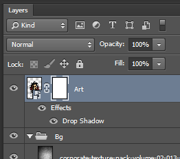
Now, let’s add the wood grain to the mix. Start by some layer housekeeping. Give the Art its own layer group, along with another layer mask.
Next, turn off all the layers but bg – #762514 (the background color) and corporate-texture-pack-volume-02-010-sbh (the wood grain texture).

Copy the content of both of these layers (CTRL/CMD+A to select all, CTRL+SHIFT+C to copy-merged the visible content), turn back all the layers on, and paste the result in the Art layer group layer mask.

This is obviously too dark and will fully erase the centerpiece. Let’s work some levels magic, so we only keep a faint wood grain in the mask.


The result is a bit too intense, as the layer is still a bit too dark.
Some more levels work will fix this:

Note the double levels pass, after the first one failed to produce a strong enough result.
And here’s the result! It looks like the piece is painted on that piece of wood, and is just fading away following the wood grain.
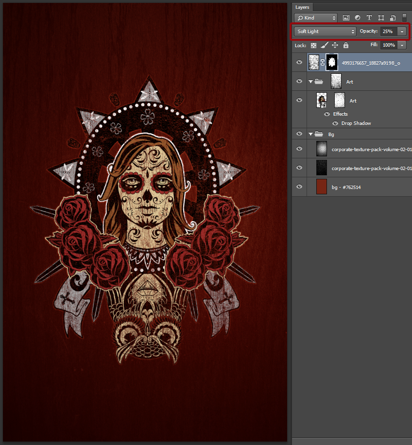
We’re going to add a texture that isn’t included in the corporate texture packs, but that is available for free on Flickr. It’s a brush stroke texture, and will help to reinforce the “painted-on-wood” effect we’re looking for. It’s called 16342_cream_over_green_detail, and it’s available on Chank Diesel’s Flickr stream. Don’t forget to grab the biggest size available! Place it into your document, at the top of your layer stack.

Repeat the whole rasterize / sharpen / desaturate / levels process…

Levels.
Change the blending mode to Soft light @ 100% opacity.
The effect is what we’re looking for, but we need to localize it to the centerpiece itself rather than the whole poster. To do so, CTRL/CMD+CLICK the Art smart object’s thumbnail. This will create a selection which will include only the content of that layer. Proceed to add a layer mask to the brush stroke texture layer by highlighting it, and by clicking the Add layer mask button at the bottom of your layer palette.
As you can see, the texture is now confined to the centerpiece. The effect is still a hair too strong at this point.

Simply lower the texture layer’s opacity to 25% opacity, and you’ll be good to go.
Close-up.

Global textures
In a ways, we’ve already started this process with the brush stroke texture. We are now going to add a few texture that will impact the whole piece (background + centerpiece). This will participate to visually make the ensemble consistent. We’ll follow the same routine as before.
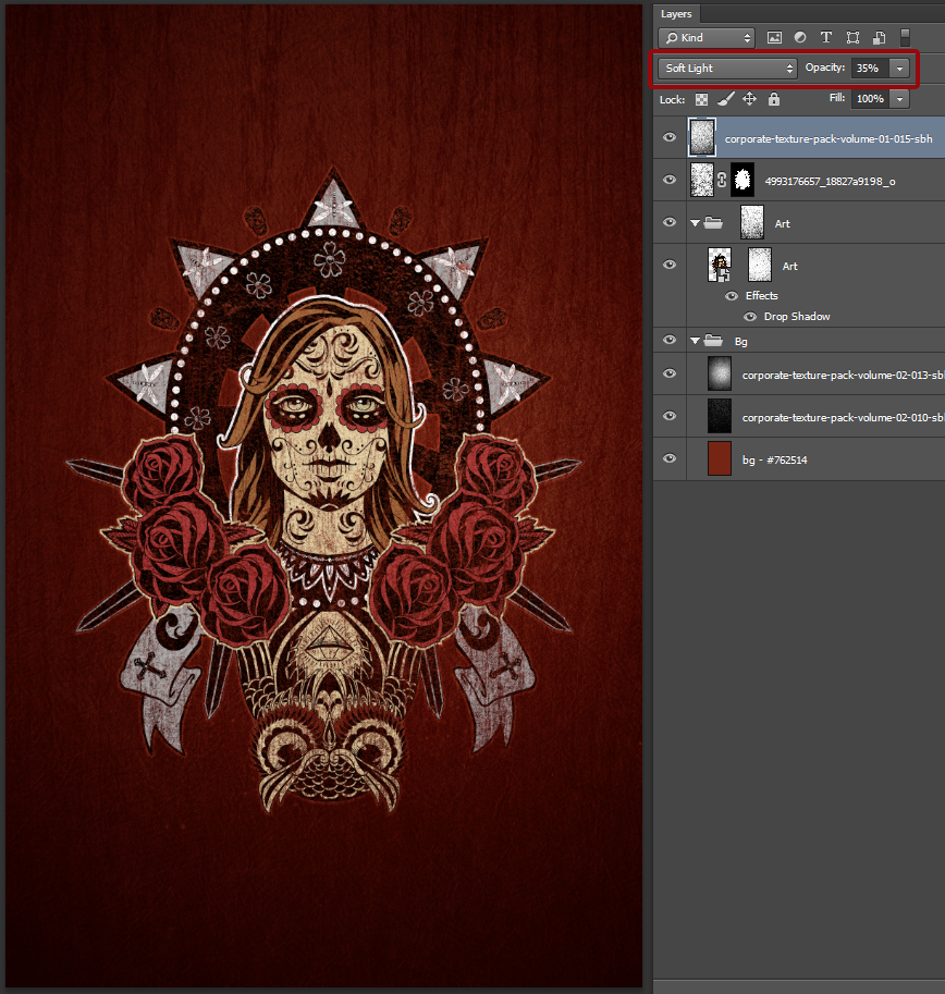
First on the line is corporate-texture-pack-volume-01-015-sbh.jpg, a wallpaper texture.

Start by placing it in the canvas so the darkest part of the texture is at the bottom.

Levels.


Put the texture’s blending mode to Soft light @ 35% opacity, and you’ll be good.
The next texture is corporate-texture-pack-volume-02-023-sbh.jpg, a scratched brushed metal texture. Our work with levels will be quite extreme, as we want to make the scratches appear in the piece as much as possible.

I placed the texture so as much as possible of the scratched are be in the canvas.

I also sharpened the texture quite a few times to make the scratches and other characteristics from the metal more visible.

Levels.

Change the layer’s blending mode to Screen @ 25% opacity.

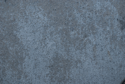
Finally, the last texture we’ll place into our piece is corporate-texture-pack-volume-02-040-sbh.jpg. It’s a concrete texture that’s been captured just outside of the building the other ones come from. It participates to add a bit of a noisy quality, and reinforces the vignette effect on the piece.
Levels.

Blending mode: Soft light @ 25% opacity.
Final touches
Bear with me, it’s almost the end!

First, I’d like to make the wood grain from the background a hair more visible. To accomplish this, simply duplicate the wood grain texture once.

The effect is too strong, because our layer is so dark. To bring this back to reasonable proportions, simply lower the opacity of the layer copy to 25%.

Now that that’s done, I’d like to add just a bit of noise to the piece. I’ll be using photocopy-noise-textures-sbh-001.jpg, from my photocopy noise texture pack. Scale the texture so it covers the whole canvas.

Blending mode: Screen @ 25% opacity.

Since this is the last texture, it’s the perfect time for a little bit of house keeping:

And with that done, you’re all set to admire your beautiful piece!

You could mock it up for the world to drool over.

I hope you had as much fun following this tutorial as I had writing in. I also hope that it convinced you of the potential of both volume I and volume II of the corporate texture packs. I’m looking forward to your own takes on this how-to. Don’t forget to share them in the Go Media Flickr Pool.
Don’t hesitate to ask any questions you may have, both about the texture packs and the tutorial itself! I’ll be watching the comments over the next couple of days. You can also find me on twitter @simonhartmann, where you should follow me.
BUY THE CORPORATE TEXTURE PACK VOLUME I