Blog
Create a Rockabilly Poster With Vector Set 22 – Part I
Hello all,
The very talented Steve Knerem is the guest artist behind a majority of the content of our vector set 22. In this tutorial, he shows us how to assemble a rad rockabilly poster using various elements of the set, a bit like what Jeff did for us when we released Set 18.
In the first part of the tutorial, Steve will be walking you through his process to design the poster, from concept to final piece. In a couple of weeks, we’ll publish the 2nd part, which will infuse the composition with an even stronger rockabilly/1950s feel, by doing some additional research in terms of typefaces by digging at the source: 1950’s/1960’s era gig posters (as well as more contemporary material too). Finally, a few weeks after that, we’ll publish a wrap-up piece that will provide additional tips and tricks to give a vintage finish to the poster, like if you had found it in your parent’s/grandparent’s attic after all these years.
But no more rambling, let’s let Steve have the microphone!
— Simon, Go Media’s Arsenal Manager
Hey Guys,
Thanks for reading my article on how I built this Rockabilly poster using the Arsenal’s Vector Set 22.

In this set you are going to notice that it’s all revolved around icons from vintage 1950’s U.S.A: hot rods, babes, tattoos and everything in between. As you search through the set notice I threw in a mix of styles from my hand drawn look to straight vector art (done in Illustrator). Have fun with the pack and add it to your own arsenal of goodies!
Let’s have a quick look at the set’s content

![]()


So let’s get started!
My thoughts to create this poster are keep it simple within the realms of design and content, yet pack a punch with enthusiasm and detail. When I think of design, I definitely try not to throw in the kitchen sink, but be selective and make sure I have for this project a title focus and an image focus. In addition to that, make sure your eye flows either top to bottom, in the “Z” pattern or in what I think is helpful is a circle pattern. These are the elements the the brain locks into and make the poster reads well, creates good flow and is a successful piece.
Choosing the Color Palette
I need to think about colors. When I thought about my color palette typical Rockabilly/50’s colors seem to be red, black, white, tan and a cool color. This isn’t etched in stone but what seems to be the norm. I know I want to go with a vintage look as it were designed back in this era.
I did some searching and remembered one of my favorite websites when I need some inspiration or knowledge. This is what popped up after doing a search for “vintage rockabilly colors.”

Thinking through the composition
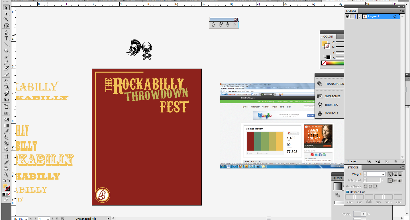
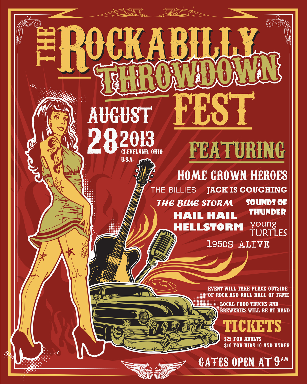
Ok I have my color palette, now for design. I am setting up this design for a 16×20 4-5 color screen printed poster for a fictitious event in my home town Cleveland, Ohio, U.S.A. I worked- up a few quick ideas and am going to call this “The Rockabilly Throwdown Fest.” Imagine a huge fest with all your favorite bands, hairdos, pinups and vintage styles for one day, sounds awesome!

I’ll first set up a ½” bleed area around the poster. This guarantees me that anything within these borders will be printed, and I don’t have to worry about it getting cut off. You could probably set up a ¼” in bleed as well.
Looking at Typefaces
I’m going to then move on to the title “The Rockabilly Throwdown Fest” and search for a font. There is an endless supply of possibilities but let’s go with something that feels like it belongs.

Quick note: if I were to choose a font that seemed like it could go with a black death metal fest, it wouldn’t have the right feel. Do your research.
Down to the Nitty-Gritty
Next let’s piece this together.
Choosing the Centerpiece
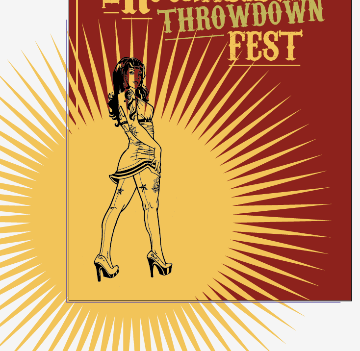
My initial thought is to utilize one of the pin ups as the main character… Maybe the devil girl.

A Layout Change
Ok, so an interesting turn of design events is taking place. I was originally thinking of placing an image in the center, but because of the title design I am thinking of something else…Let’s see where it goes.
Let’s Change the Centerpiece, and Let’s Add Some Supporting Design Elements
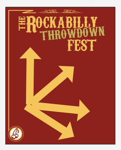
I like this pose better, and I think she goes better with the design. I know I want some sort of starburst in the background to create a sense of depth so I grab the star tool and set it to 75 points.

I want to trim the bottom and left side so I take the pen tool and make three points in at “L” shape. Make sure the color is selected in the stroke color box. Note the purple color “L” at the bottom left of the artboard.
While the “L” shape is selected, I also select the starburst then I go to the pathfinder panel and select the divide button all with my black arrow tool. Both images will look united, but then click on the part that looks cut away with your white arrow tool and delete it. The starburst might spill over the document parameters, so you will have to select those parts and delete. From here select the starburst with your black arrow tool and choose a fill color in the color box. Most likely you will see areas fill in the where your dividing “L” line was.


These are a few extra steps, but this makes the object complete. Click off on a blank area and select the parts that are spilling over and the parts that filled in with your white arrow tool and delete them. Click off on a blank area, then click on the starburst one more time and select unite in the pathfinder panel. I like to do this just to give it a final merge of the object. Now you are all set. Now we can play with different colors of the starburst and create some background texture/depth.
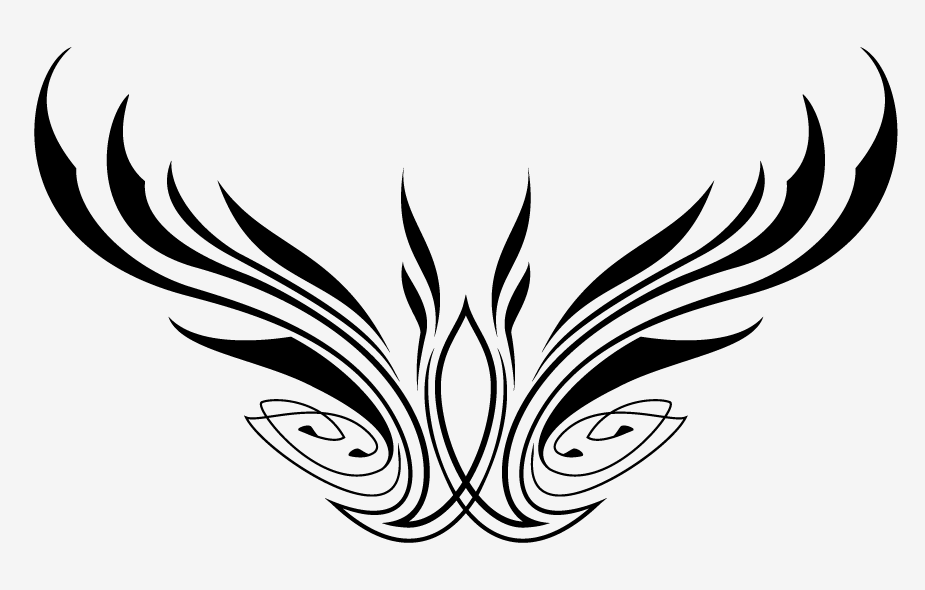
Remember the arrow patterns I drew once I noticed the design took a different direction? Well, I want to keep this design going and incorporate all things related to the fest. So let’s grab a guitar, a microphone, and an old car. I also swapped out the pinstripes at the bottom for some military looking wings. Also, don’t forget to switch the starburst’s color to a red slightly brighter than the background. The yellow was too strong, and overpowered the character.


Adding More Supporting Elements
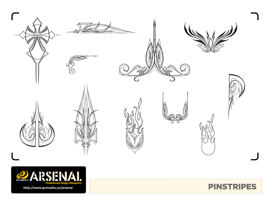
I have in mind flames also, pretty iconic piece for this scene. But something a little different… like this, from the pinstripes pack.
I know I don’t want to use the whole image, only half. So, I have to cut it in half.
Here’s how I did it:
Select your lasso tool, and draw around the part you DO want to keep.

Cut it and paste it back (CTRL/CMD + X, then CMD/CTRL + V or F). Select the image and select unite from the pathfinder panel. This is so there are no open points and you can select it and change the color any time. Let’s place it on the poster in a few open spots:

Quick note: the one placed left of the pinup had its color changed to the same red as the background. Since it’s overlayed on the starburst that’s lighter, it gives it that sweet punch through effect. One more thing to play with!
Time to Add More Copy!
Quick note: work around the canvas and DO NOT focus in one area for a long period of time. You have to work around the canvas/design and give most areas enough attention. Say I completed this bottom left part completely and came back to it in two days. Well some of those fresh thoughts will be gone and you need to think through the design once again. If you work around the canvas little by little you can give most of it attention and develop those first thoughts.
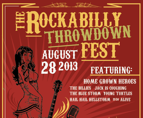
Alright, back to the game. Keep developing the text, make parts pop, and make the fonts of the bands specific. If you look at any poster the bands will have their own text font.

Time to Make Sense Out of the Mess of Items at the Bottom Left
When coloring for a spot color project such as this poster or a tee shirt, you’re limited to one color choice usually. This is where you need to be selective/creative and think this through.
All I did here is create color shapes and place them behind the character and objects.


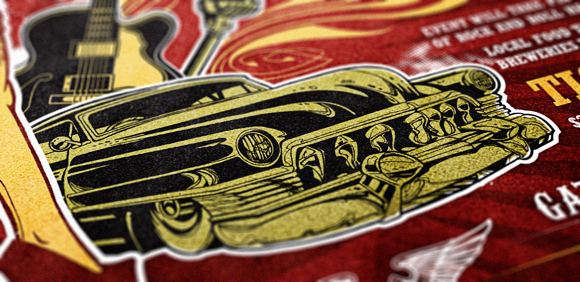
Here is another technique that is good to use especially with my hand drawn pieces. If you know my style or if this is the first time seeing it..it’s pretty detailed… Yes? So here is a time saver. Make a copy of the outlined image and place it behind the original piece. Lock the top original piece. Select the car with your white arrow tool. Select merge from the pathfinder panel then add a fill color to the color box then unite it using the pathfinder.


Change color and we just saved 10 minutes of using the pen tool.


Do the same with the microphone and the guitar and now we can take this to the next step.

Adding a Tad More Depth, and Other Refinements
I also wanted more dimension that just the starburst in the background. So I took the flames from the pinstripe pack pack and made this into a solid image by repeating the steps we just did for the car. You just got a free vector! Take a look under the pinup at the light red flames, cool feature and more interesting things going on.

Time to add some finesse to the border. You can taper the edges by expanding the stroke of the frame, then deleting the top point of the square edge.

I also added a stroke to each image. You have to add the stroke to a solid image that is underneath all of your layers. For the car we have two layers. One is the black outlines and one is the green color. Add the stroke to the green color. Make sense? Notice I changed the black lines to red… Looking cool!

Well I’m liking what I see, title reads well, colors look cool, feels like a Rockabilly poster.
Last Touches
Last thing I like to do is add a touch of my own flair. In this case I’ll grab some dot patterns from the symbol box.

I’ll just throw a few down and figure out what I like.
Next I’ll expand it because I don’t want to use the whole pattern just parts. So click on Object > Expand.

I’ll then take the lasso tool and cut out random parts that I want to use.

Cut then paste it then unite with the pathfinder using your black arrow tool.

I like to place these splatters behind the white stroke and make it the color of the stroke, in this case it’s white. So now we have a cool 16″x20″ – 5 color promo poster!
Let me know if you have any questions, go crazy with these vectors and send me your designs: put them in the Go Media Flickr Pool, and/or in the comments! One thing to add is that I illustrated a mix of hand drawn and vector/Illustrator images. This adds a really nice feel of that hand drawn look yet utilizing the strengths of Illustrator.
Enjoy guys!
— Steve Knerem
Note: find Steve online at: